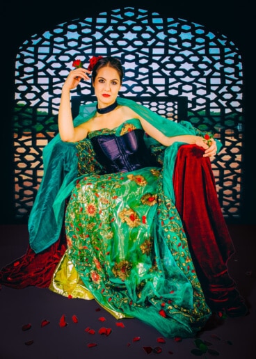
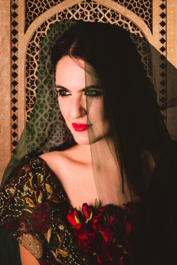
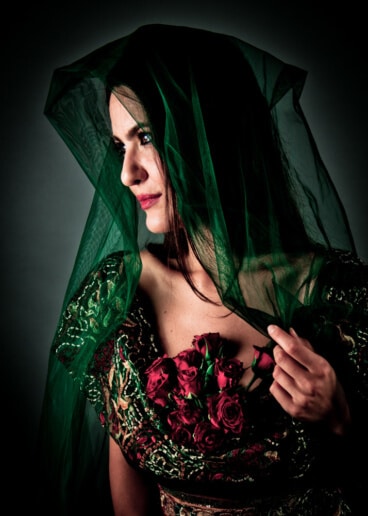
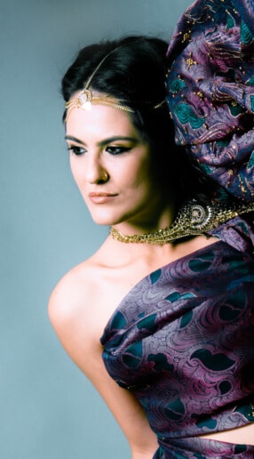
Provenance
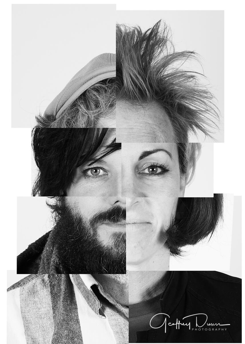
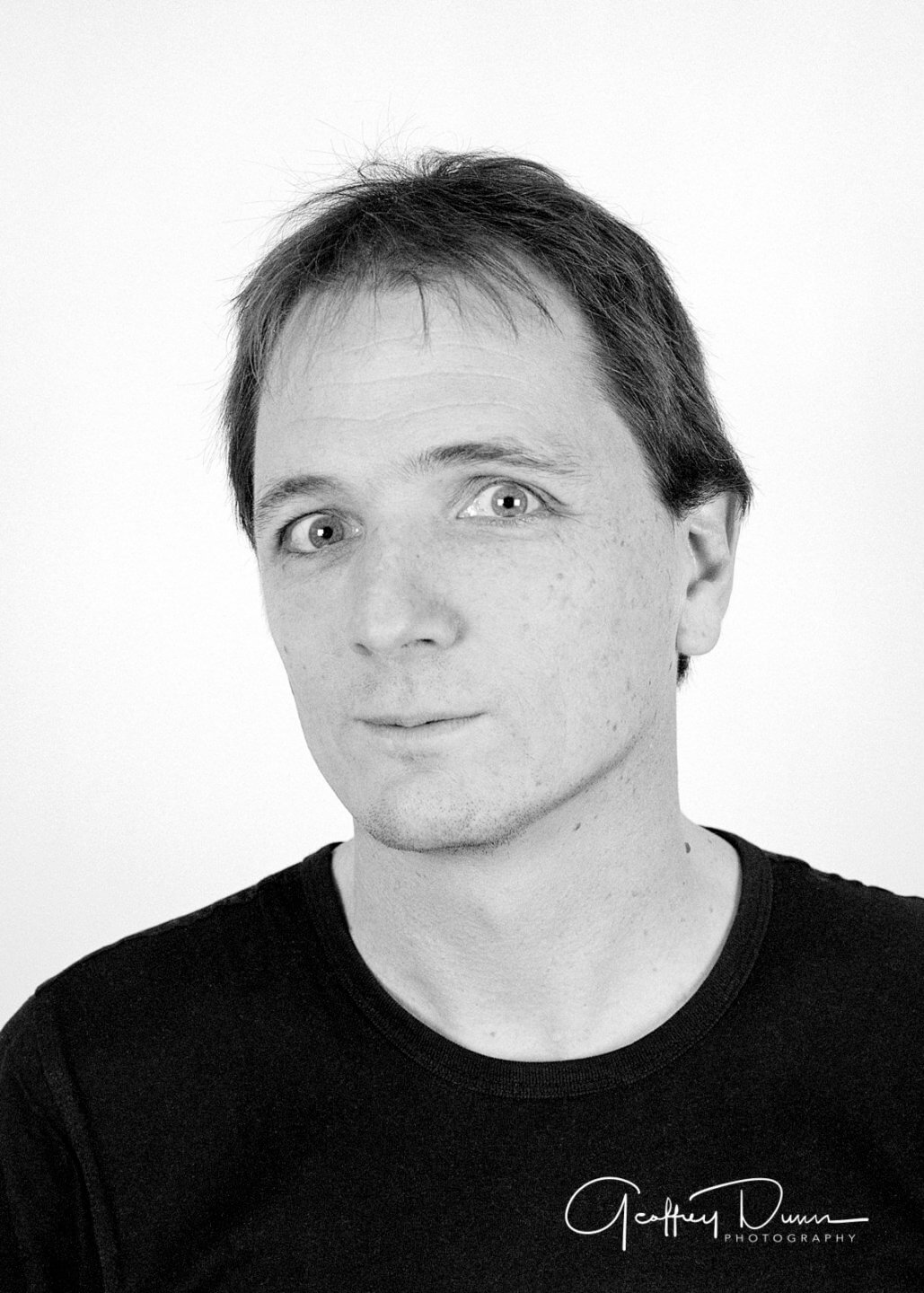
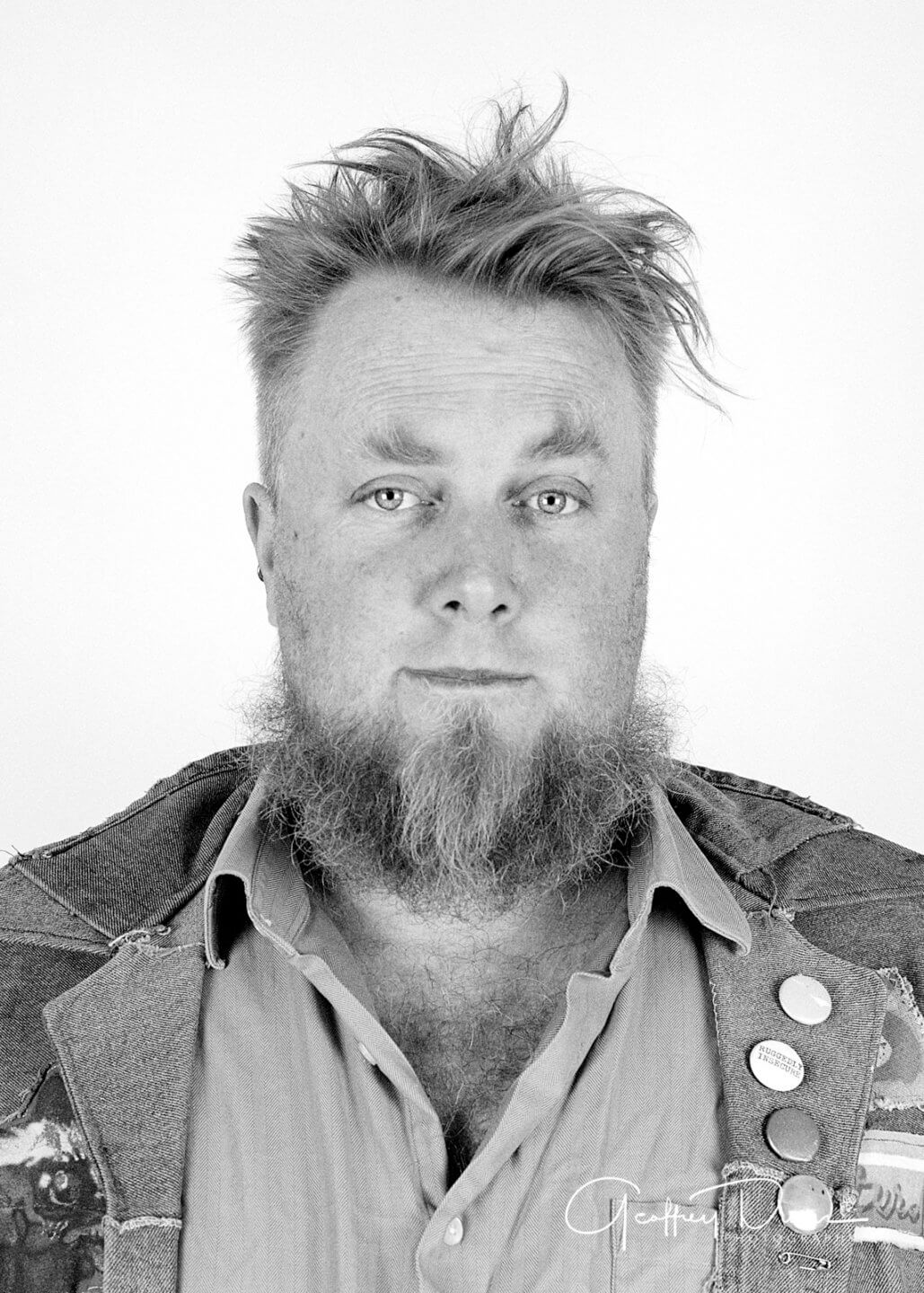
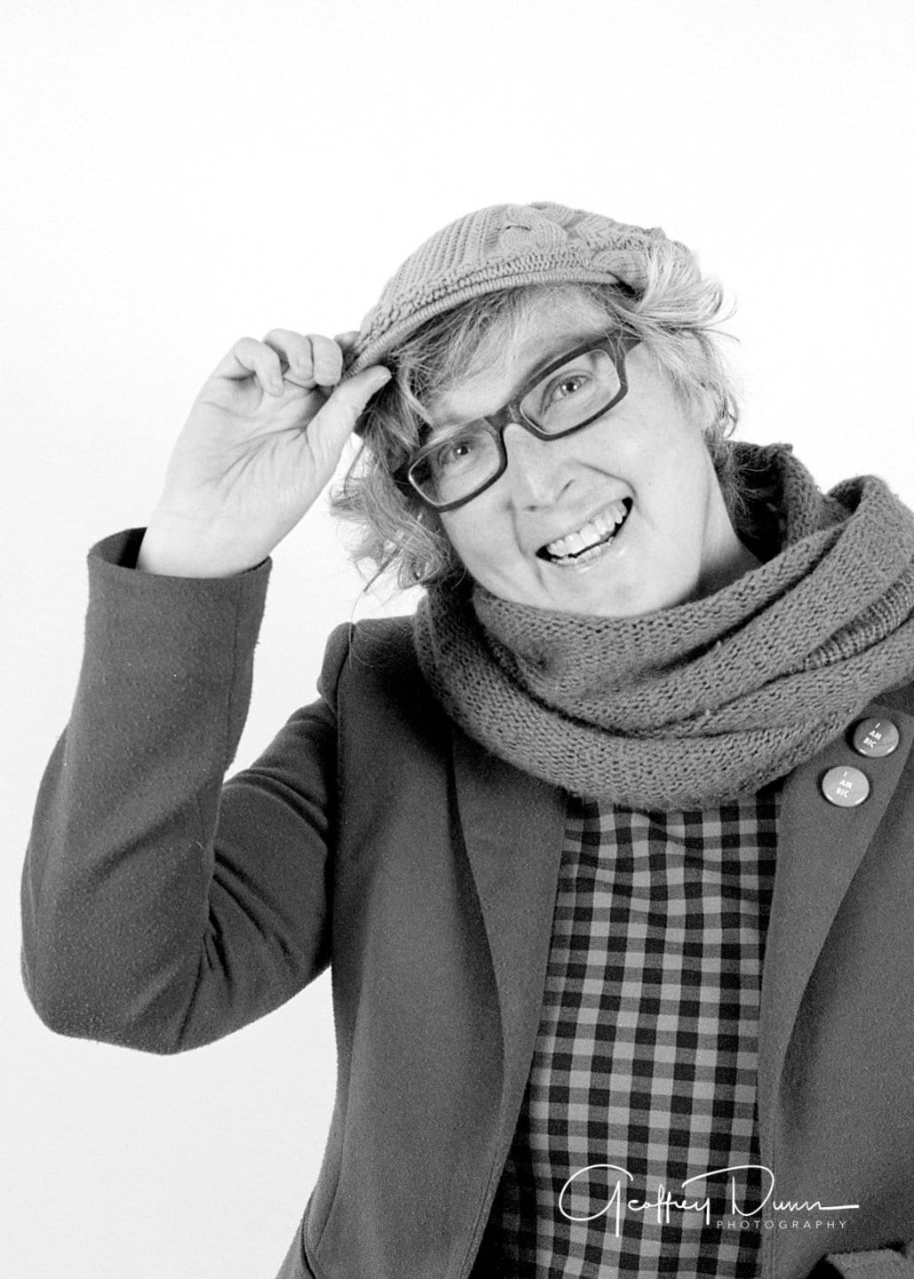
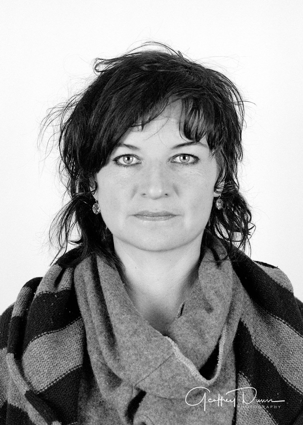
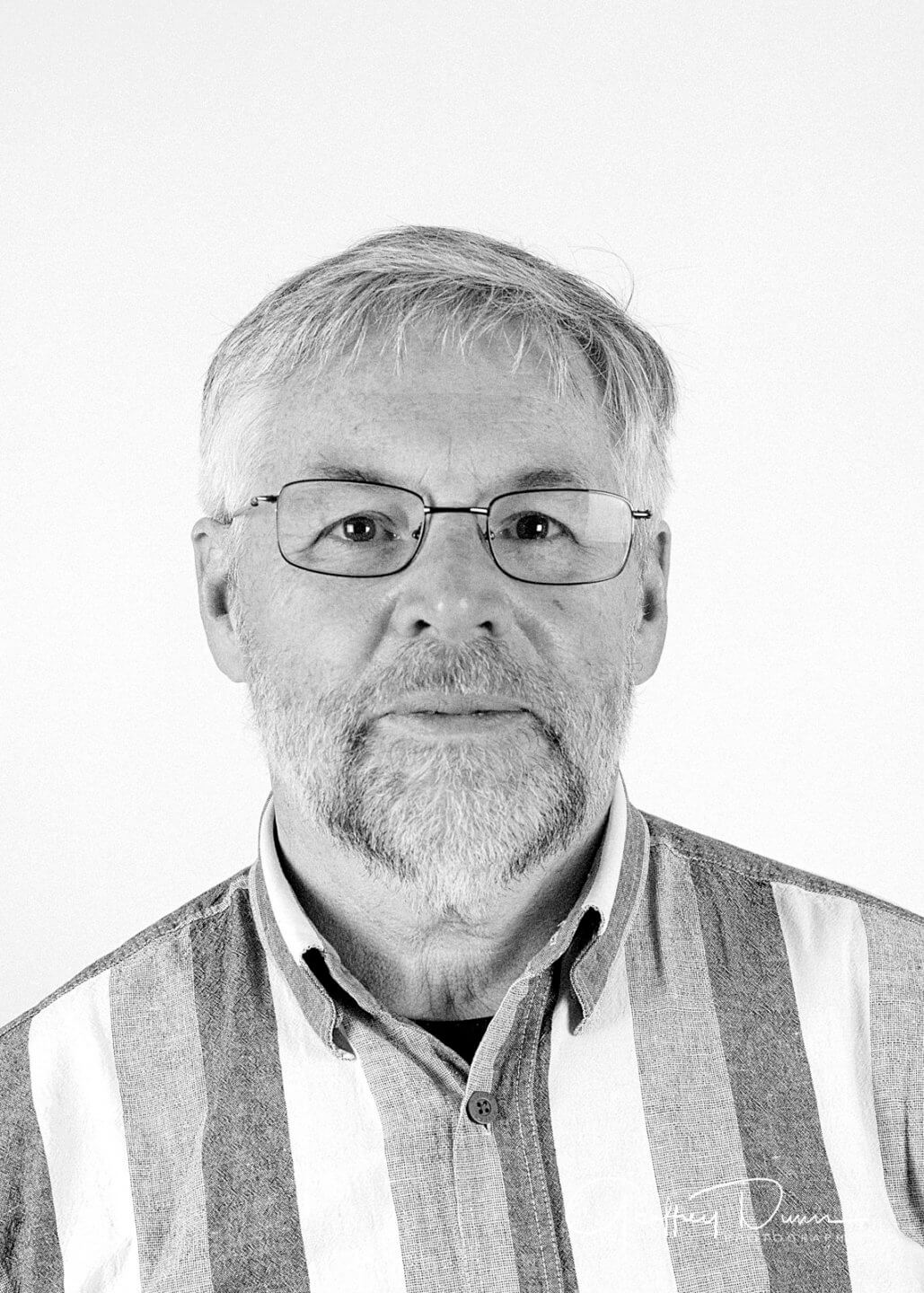
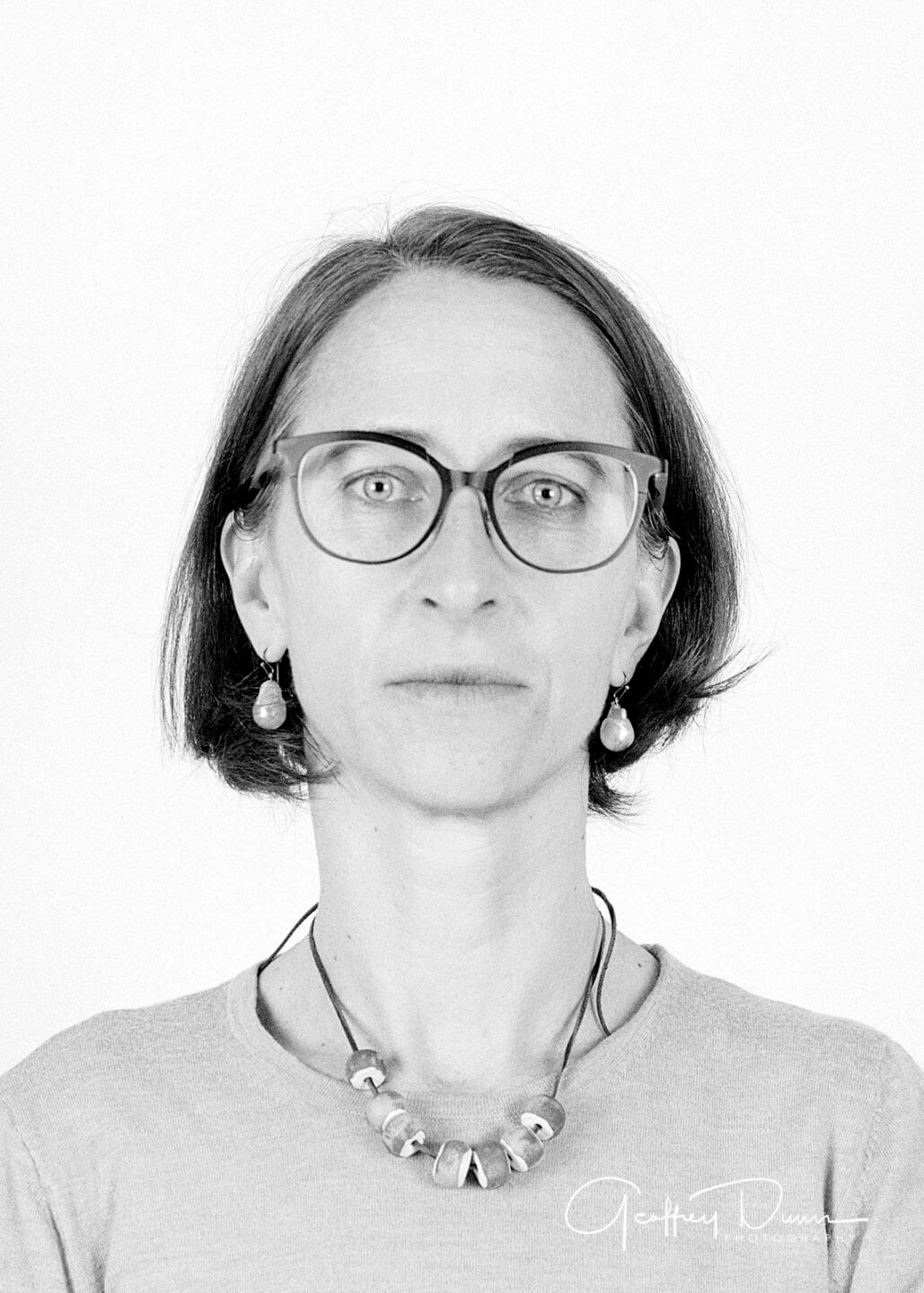
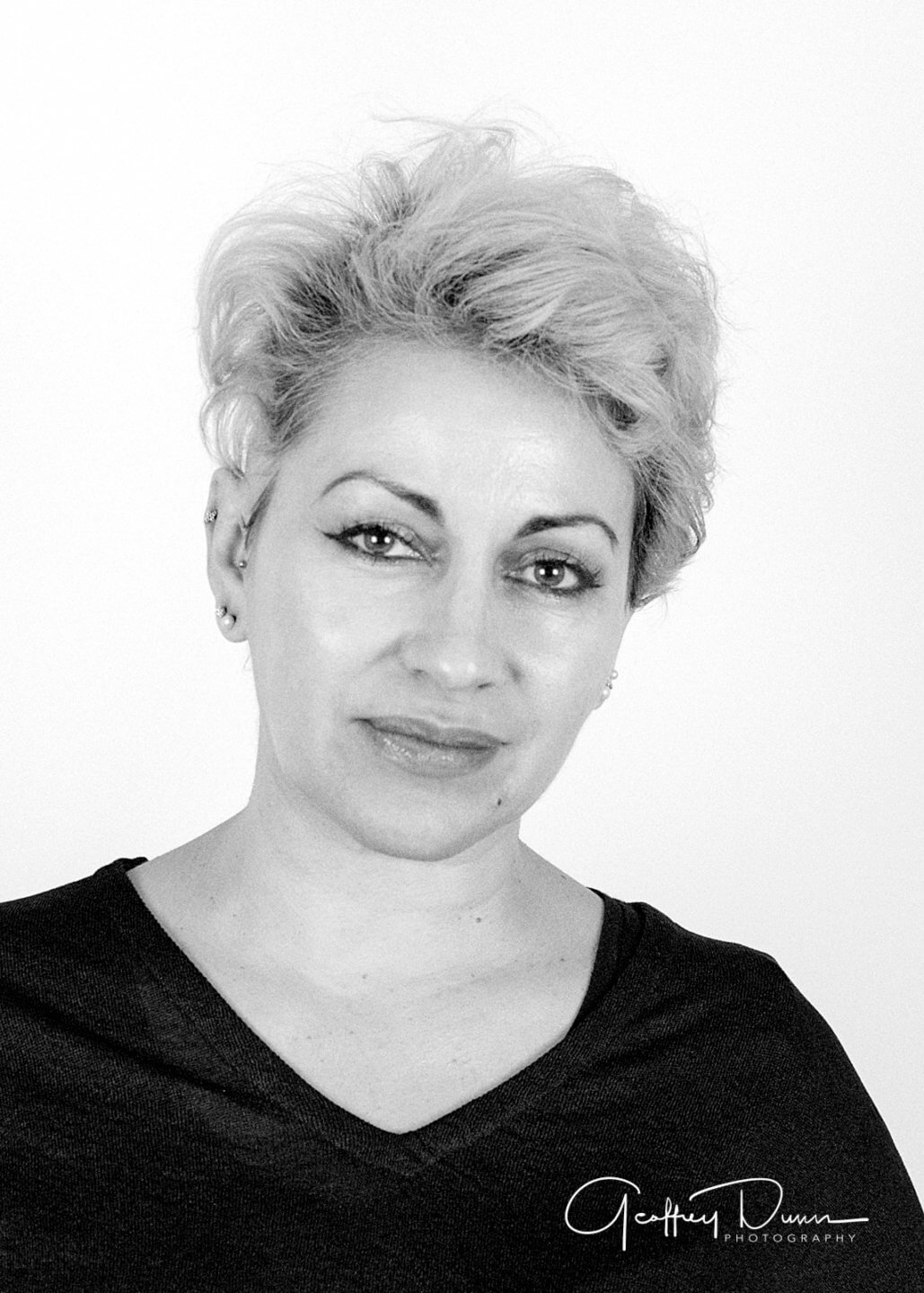
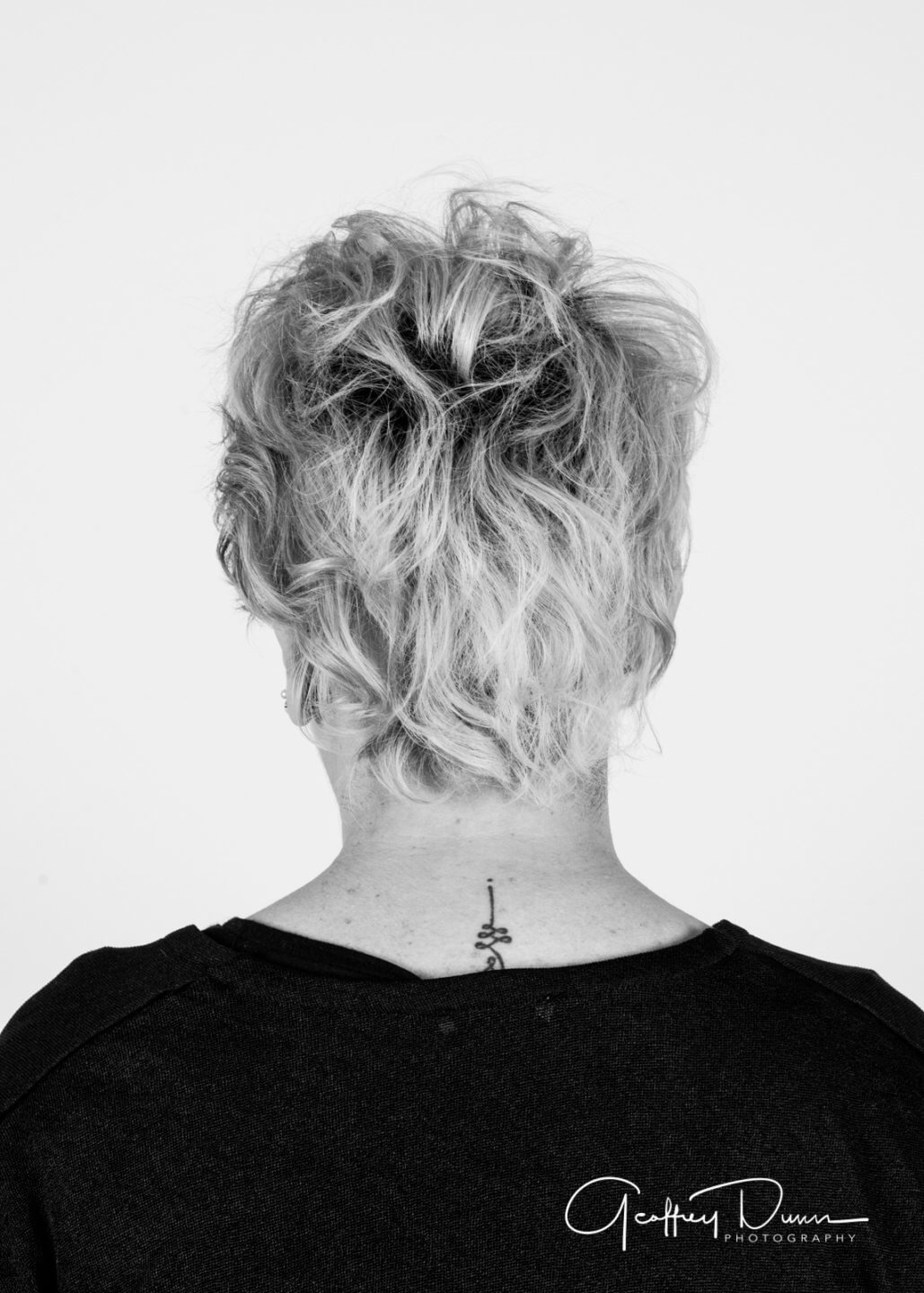
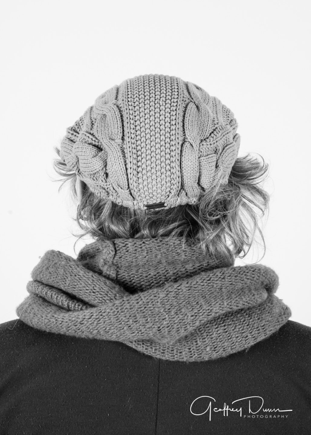
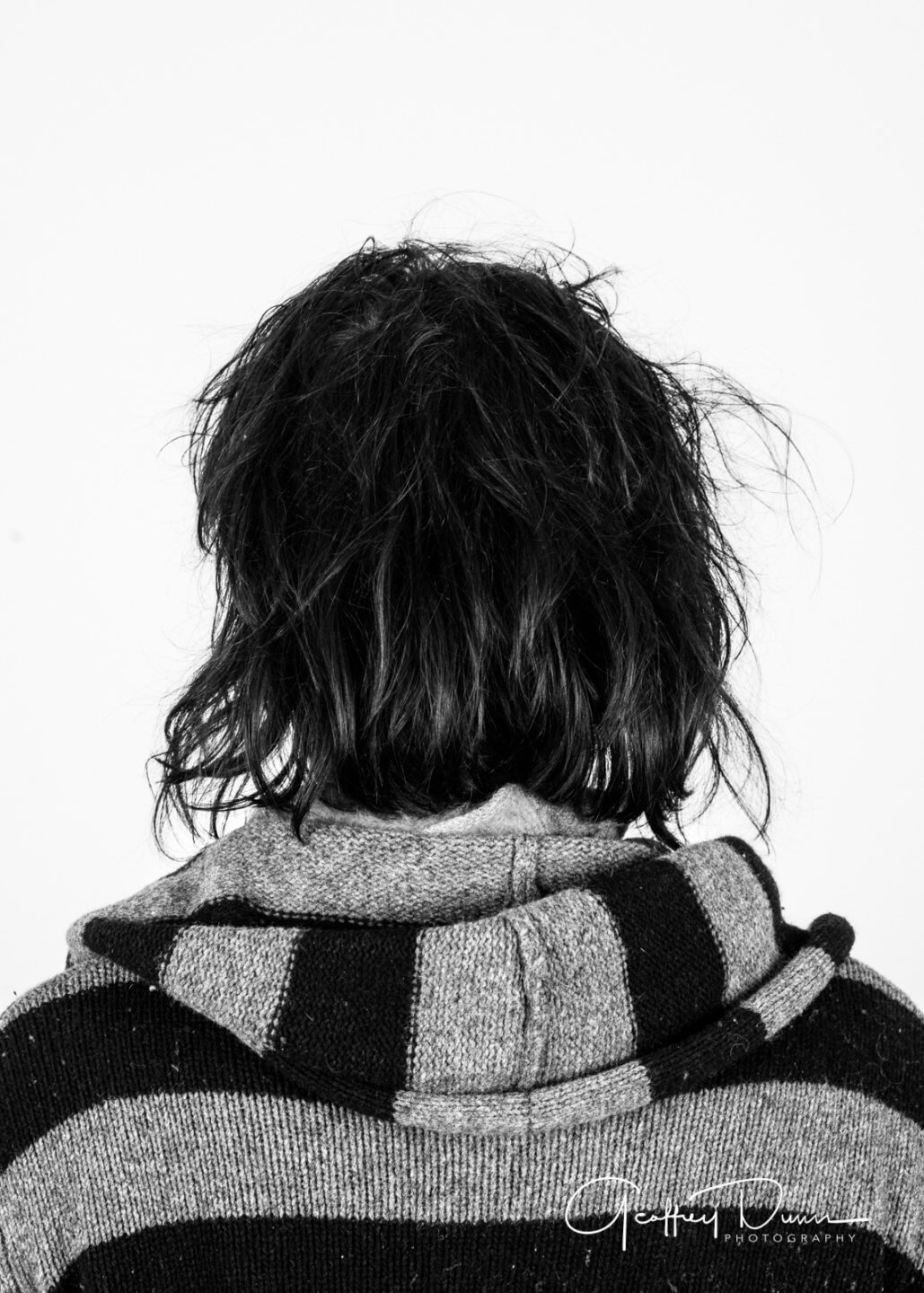
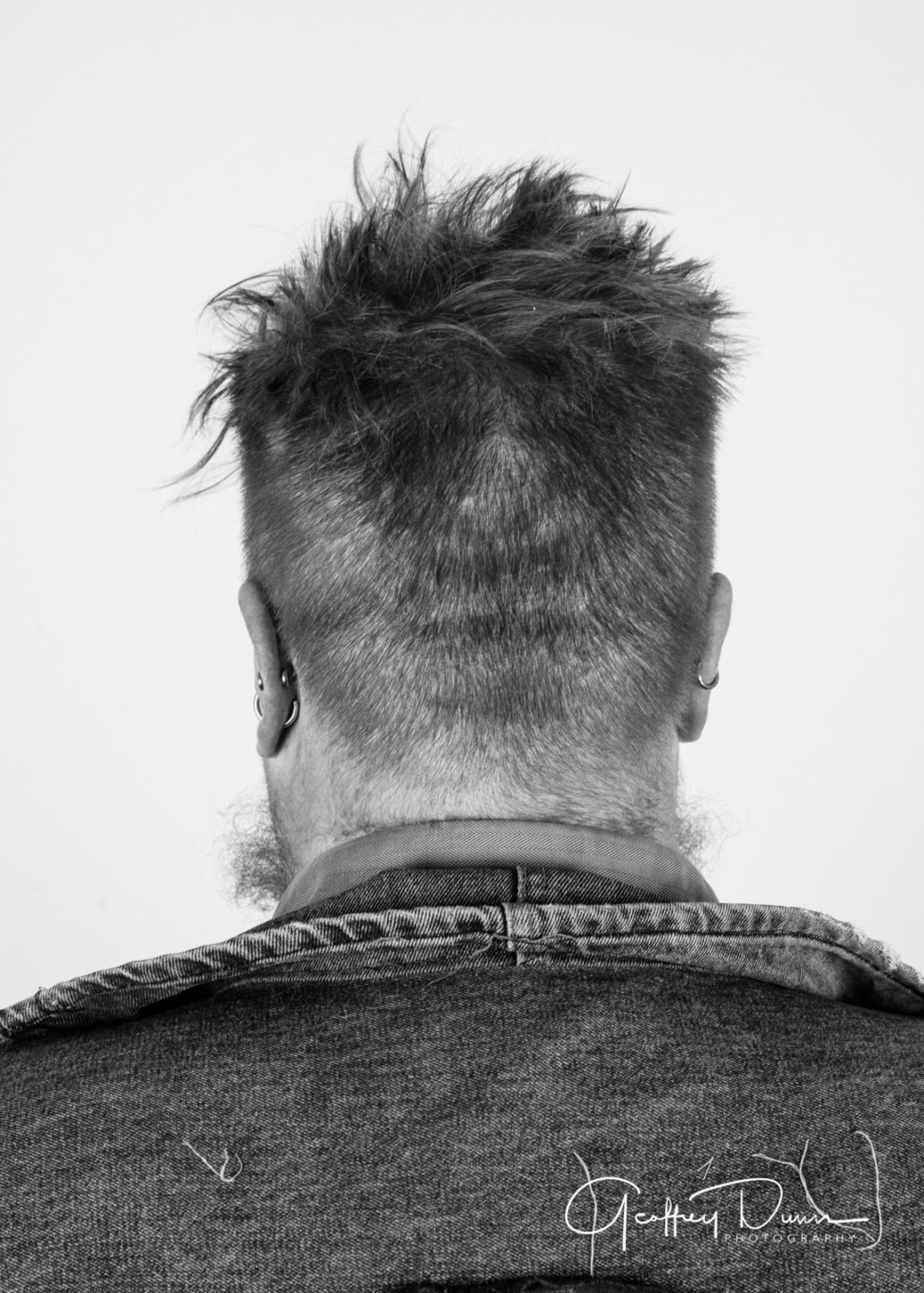
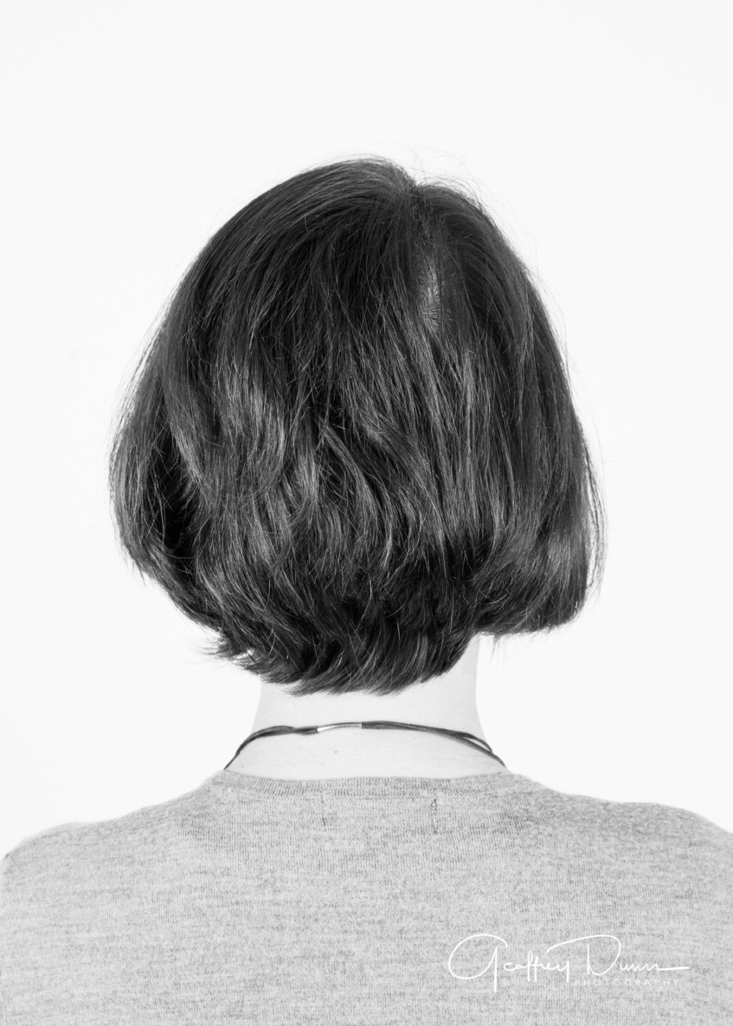
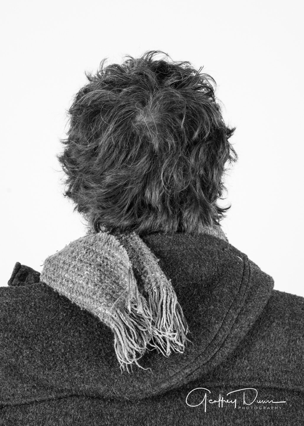
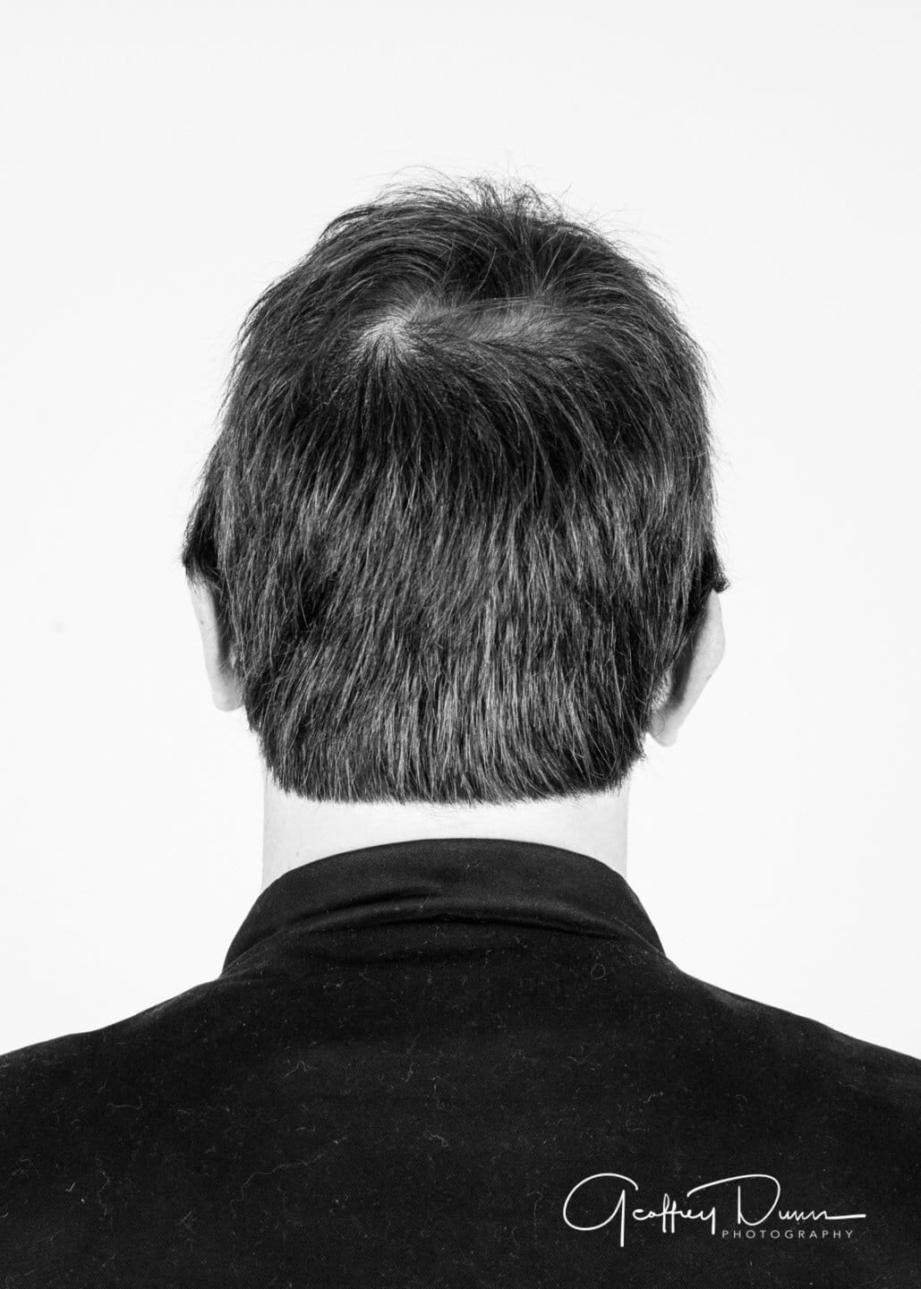
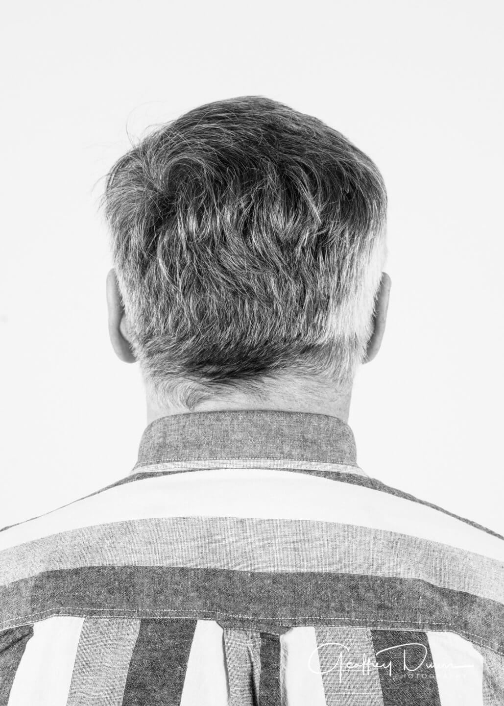
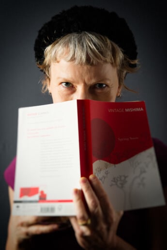
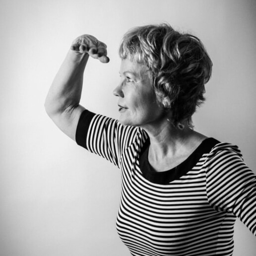
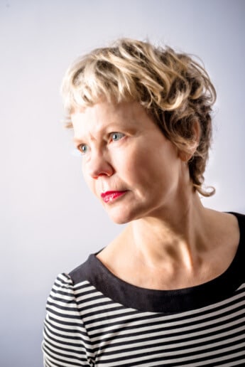
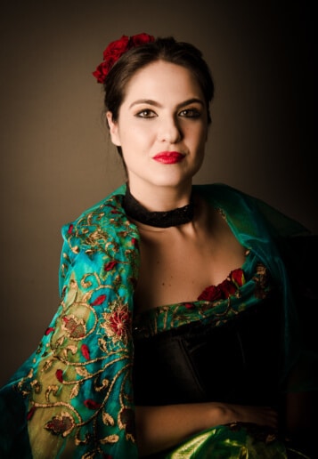
Painters, Printers, Sculptors, Photographers, Sound Engineers and Poets ... we can often become familiar with artists' work but not the indivuals themselves.
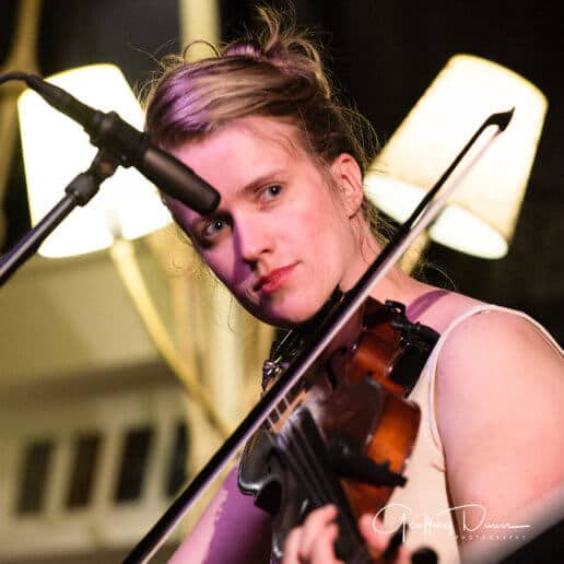
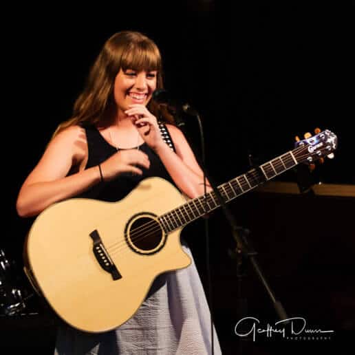
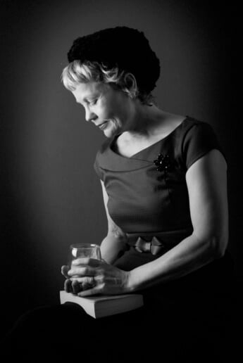
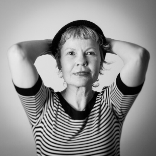
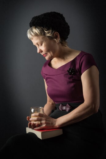
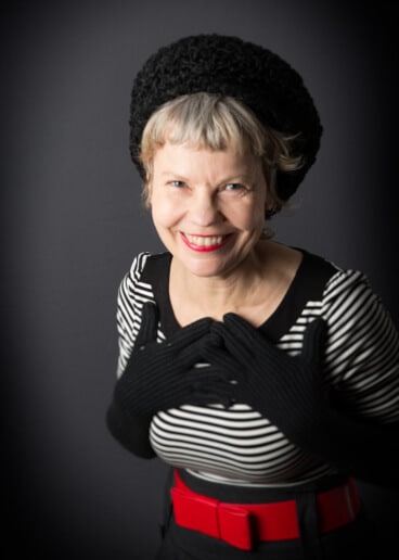
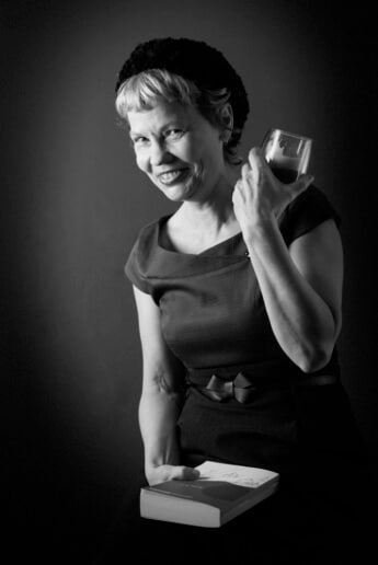
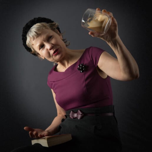
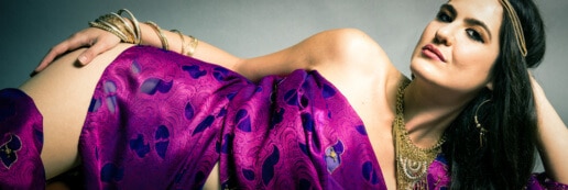
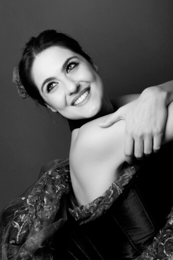
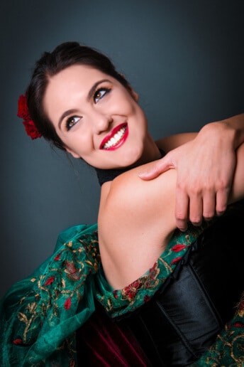
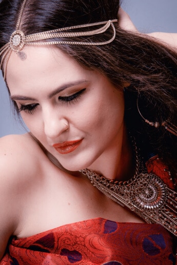
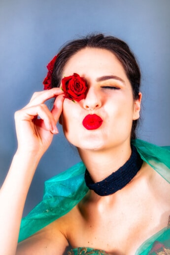
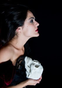
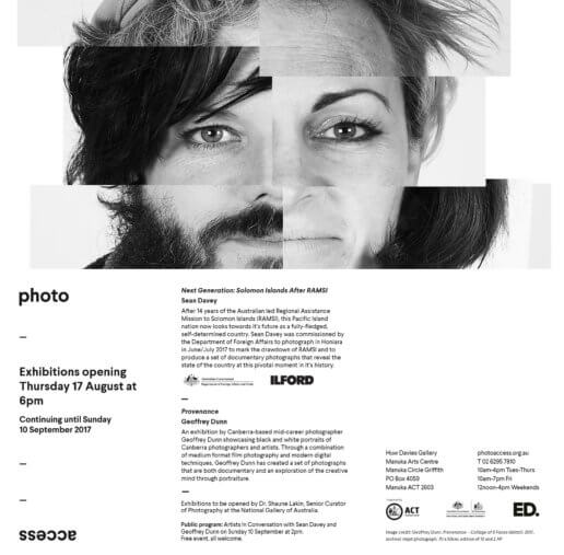
With Provenance I wanted to create portraits of artists behind the art. I chose to present them decontextualised from their art practice so as not to influence or distract you, the viewer, from the presence of the person in front of you.
The portraits were created through a combination of medium format film photography and modern digital techniques. My first major show for 2017 is on now at the Huw Davies Gallery, Manuka Arts Centre until the 10th of September. Thank you to everyone at PhotoAccess who has been fantastic in the preparation for this show.
The Portraits
The Artists (and the Backs of Their Heads)
The Invitation
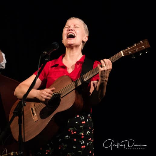
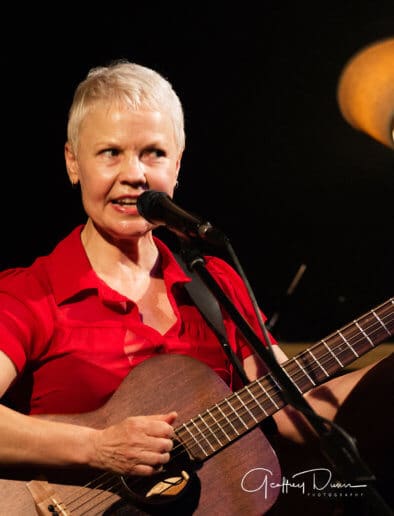
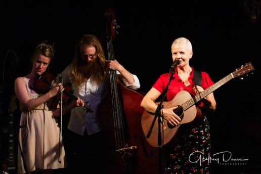
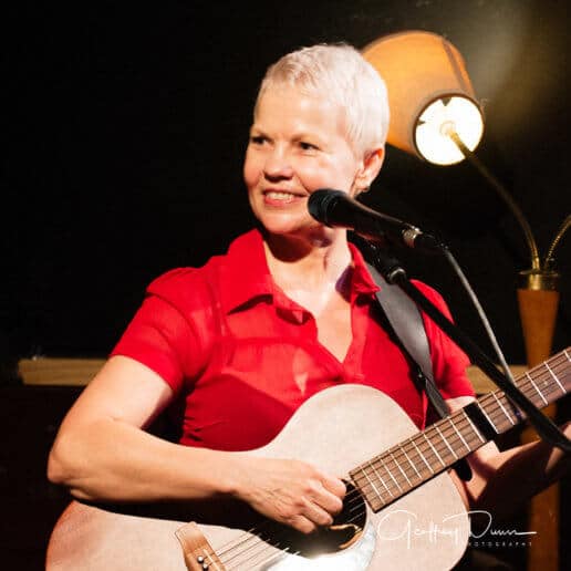
Shoot: Lisa Richards Live
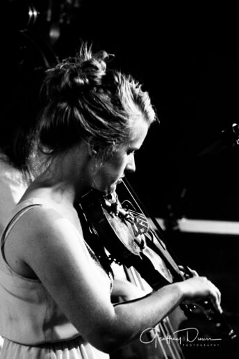
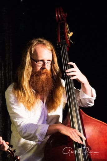
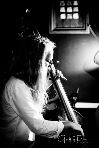
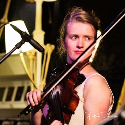
On a ridiculously hot evening in January I had the pleasure of photographing Lisa Richards at Smith's Alternative in Canberra City. Lisa was promoting her new album A light from the other side and playing songs from her multitude of other, excellent releases. Astute readers will know that I contributed artwork to this album along with a number of other professional media photos.
Lisa was joined on stage by Matt Nightingale on double and electric bass and Jeannette Bradley on banjo and fiddle. It was a lovely intimate performance and well suited to the Smith's Alternative venue.
Lisa's album (and her other releases) are available from her website.
Shoot: Lisa Richards
The wonderful musician Lisa Richards recently engaged me to create an image for the back cover of her new CD release A Light From The Other Side. Lisa had seen a moody montage I published using a photograph of Marina ... she loved it and wanted something in a similar mood for the cover. I explained that it was a montage and I would be happy to shoot some studio images of her and simply place (I say simply but successful montages are never really ever simple) her into the existing montage. I had to adjust the document to fit in the dimensions provided by the graphic designer but we were very pleased with the result.
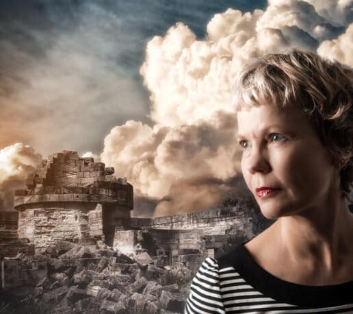
And here's the completed cover.
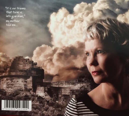
Since we were in the studio we took some publicity type pictures as well.
The album is pre-selling now. I really like it. Do yourself a favour* and grab a copy. Do visit Lisa's website too and have a listen to her previous work ... great listening :-)
*apologies to Molly Meldrum ;-)
Rapturous and RAW Artists
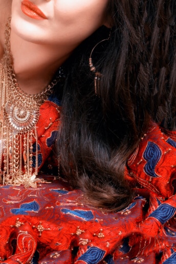
Recently did a shoot for Liza Alwast of Rapturous who is putting together a show for RAW Artists here in Canberra. Liza collects and works with fine textiles to create stunning dresses and couture. The show is one component of the TREND show presented at the Belconnen Arts Centre from 6:30pm on Friday 17th June 2016.
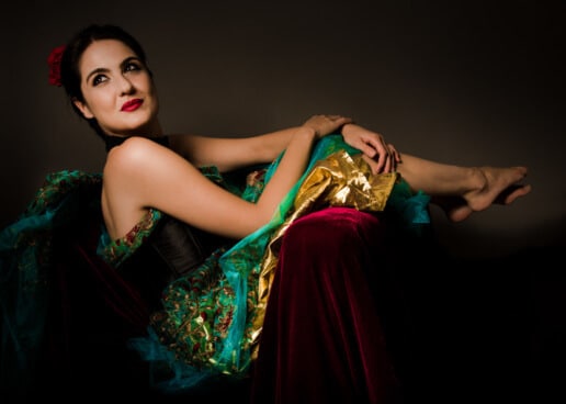
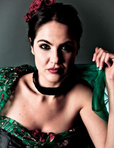
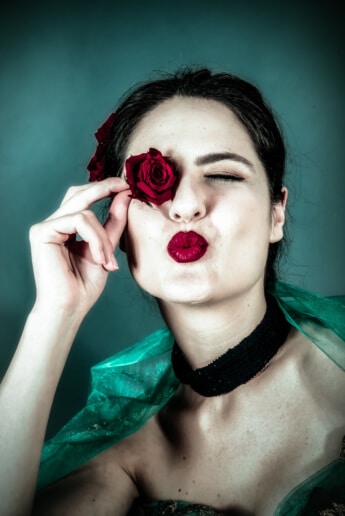
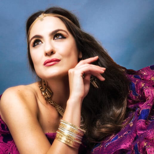
The shoot was conducted in a studio setting with Marina modelling. I have created a number composite images (substituting background images et al) to create a more interesting setting. These one's aren't particularly hard to pick ;-)
Thankfully, Liza has provided me with a ticket to the event and of course I'll be taking my camera so stay tuned for more from Rapturous ad Raw Artists :-)
Links
2016 Lights! Canberra! Action!
So, following on from the success of being shortlisted for our entry in the 2015 Lights! Canberra! Action! Marina and I set about making an entry for this year's short film festival. The film is titled '237' (after the hotel key that must appear as one of specified objects).
The format of the festival stipulates that entrants have 10 days to shoot and submit a film. The film must contain 10 specified objects or places and be somehow linked to a nominated theme ... this year's theme was 'Chance'. The ten objects or places for this year's film were:
- A deck of cards
- PJ O'Reilly's - either southside or the city
- Weather Report 'Chance of rain' - this item can be audio
- Weetangera Cemetery - MAP
- A question mark
- The National Film and Sound Archive
- Dice
- The Police Box on Red Hill by Geoff Filmer - MAP
- A raffle ticket
- The key to room 237, Avenue Hotel
We managed to include all ten ... see if you can spot them!
Our movie is largely a meditation on the nature of freedom, it's a kind of love story and it's narrated beautifully in Italian by Marina.
And since we were shortlisted and made the Final Twelve we got to attend the public screening of all twelve shortlisted film at the Rose Gardens, Old Parliament House.
Here's a picture of Marina and I accepting our finalist certificates from Chris Bourke MLA
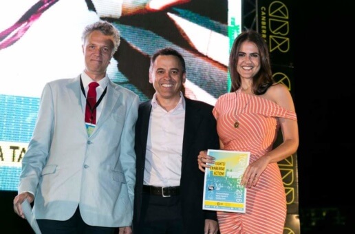
Please let us know what you think of the movie in the comments below :-)
Back & Forth
'In Sequence'| PhotoAccess members' exhibition - Back & Forth
I have a new piece in the first Member's Show of 2016. Entitled Back & Forth, the work comprises a sequence of 7 images looped and presented in a digital frame. It looks mesmerisingly cool. The opening is next Thursday (28 January) at 6pm at the Huw Davies Gallery.
Some gallery blurb about the show
The first PhotoAccess members’ exhibition for 2016, 'In Sequence' presents works creatively addressing the notion of sequence and narrative in photography. For many artists, photography is not only about single images, but relationships between multiple images. A sequence of images can tell a particular story or narrative, create a sense of visual poetry, or suggest movement and time passing. 'In Sequence' aims to showcase a variety of approaches to the notion of the photographic sequence, using traditional, experimental and digital photographic techniques.
• Opening: 6pm 28 January 2016
• Where: PhotoAccess - Huw Davies Gallery, Manuka Arts Centre
• When: 28 January – 21 February 2016
New Show: Barriers - Break or Breakthrough
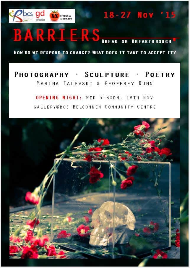
I'm very pleased to announce my next show Barriers: Break or Breakthrough opens next Wednesday at the Belconnen Community Center. A collaboration between myself and Marina T, the show explores our different reactions to change. Our working proposal:
Change is a fundamental part of the human experience. Often our difficulty in accepting change can stem from our inability to understand it. Barriers explores the the transitional processes involved in interpreting change.
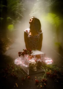
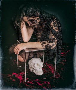
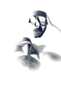
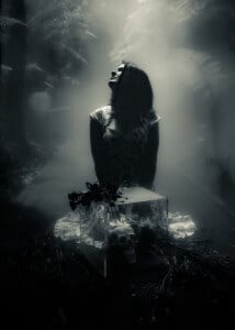
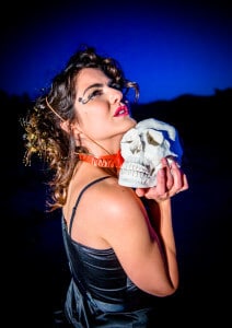
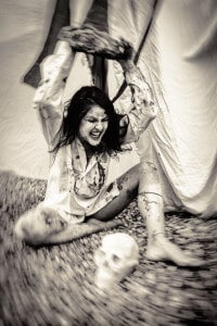
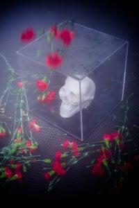
The exhibition revolves around the centerpiece of a glass-encased clay sculpture of a human skull, which acts as both metaphor and motif of change. Meditations upon the centerpiece take the form of sculptures, and poetry.
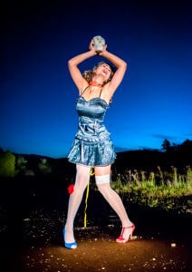
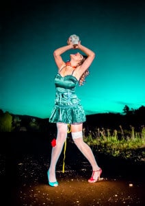
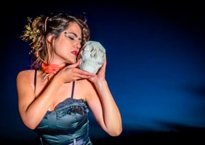
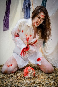
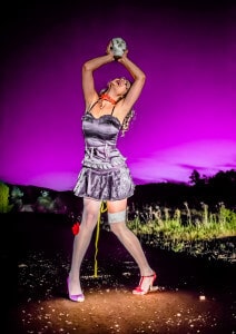
The skull, which we have nicknamed Eno was made by Marina, features in each of the photographs. Each of the photos explores a different emotional response to change ... these comprise Anger, Fear, Denial, Delirium, Mourning and Acceptance. Here is a selection of the photographs from our shortlist for the show.
The show also features several poems written especially for the show and a number of new clay sculptures from Marina.
We made a flyer advertising the show too ;-)
Along the way we have also established domain for our working collaborative artistic endeavours 2 Tens & A Tomato under which we exhibit and also produced a short film (shortlisted at the 2015 Lights! Canberra! Action! short film festival. The site is a little lean at the moment as we concentrate on getting things together for the show and really only shows a copy of the flyer for the show but please stay tuned on that front.
Links
- About 2 Tens & A Tomato
- 2 Tens & A Tomato
- Sexy monochrome flyer version
If you're in Canberra next Wednesday evening (18th November) at 5:30pm ... please come along and say hello to us :-)
If Canberra is simply too far to come ... please wish us well :-)
#gdphoto #2tensandatomato
The One Project
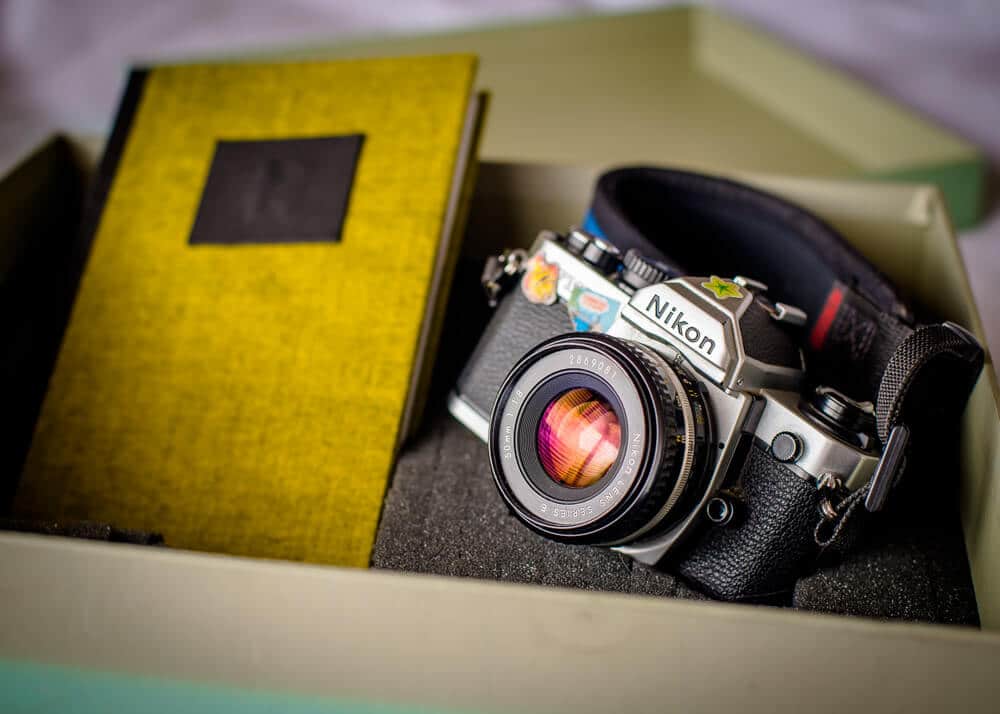
Toward the beginning of the year I had lunch with my friend Hilary Wardaugh, an accomplished photographer around Canberra, and she described a project she was putting together. Hilary explained that she had a Nikon FM-2 manual film camera with a 50mm f/1.8 lens laying around and was planning to load a film into it, compile a list of photographers and pass the camera to each photographer and ask each one to take a picture. Once the picture has been taken, it became the photographer's responsibility to contact the next person on the list and arrange to get the camera to them. At the end of this process, about 3 months, Hilary will get the film developed and scanned. Each photographer will their digital negative and can process it as though preparing a print in the darkroom ... that is curves and levels and filter colours but no pixel based PhotoShop edits et al. The processed negative will be passed back to Hilary who will then arrange printing of the image for the purposes of exhibition. Two shows are currently lined up for the prints, one local (at the Huw Davies Gallery in Manuka) and one in Sydney (as part of the Head On Photo Festival).
The camera travels in a box containing the list of photographers, a cable release and a book in which the photographer is encouraged to write a short piece about their picture. The project is called The One Project.
So far so good... the only stipulation was that our picture had to be a portrait!
No pressure... it's only a single frame... I mean it's not like the other twenty-odd photographers are all accomplished photographers (they are!) and will be doing their very best as well... reading through the book I smiled when I saw that everyone else was obsessed with light, exposure and focus ;-)
I wanted my portrait to be of my artistic collaborator Marina. I have photographed Marina extensively over the past two years and together we came up with the idea that often you only have an impression of someone through the images you see of them. So I put together a grid of photos I have taken of Marina and projected them digitally across her face and arms and splashed across a dark background the pictures resemble stained glass. I set my digital camera to emulate the manual settings of the FM-2 and to act as a light meter for correct exposure. The effect is one of an essentially dark shadowy image with bright pictures shaping contours but ... visible upon closer inspection ... you see Marina illuminated and looking out from the shadows. It looks great.
Then it was swap the camera over on the tripod, recompose and recheck the settings (and recheck them again!) ... I re-posed Marina and got the composition right and while she was looking perfect I felt it was right pressed the shutter release ... pa-tchang! Done! In my excitement however I had failed to warn Marina I was about to take the picture and she thinks she may have blinked but can't recall where the blink may have been in relation to the exposure. I'm sure it'll be fine! I do feel like a goose though! My main concern is that given the dark nature of the photograph (light-wise not emotionally-wise!) and the different response of the film to shadow and highlight my contribution to the project may in fact just turn out to be a black frame! But then that's the risk you take in trying something less safe I guess :-)
The photos I took with the digital body look great and I would include them in this post but I don't want to publish anything until I see how the film version came out which won't be until November. I'll do a contrast and compare then as a separate post :-)
But I would like to thank both Hilary and Marina. Marina firstly for being my muse and sharing her art, ideas and vision so freely with me ... my world simply wouldn't be the same without her in it. And Hilary for coming up with the idea of The One Project and making it happen, for the necessary artistic angst and discipline (well OK maybe I didn't take home all of the discipline lesson) this project inspired in me.
Reupholster your office chair
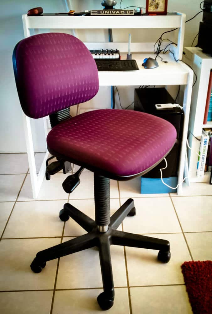
OK .... while I'm not about to turn this blog into a DIY extravaganza site, I did do something this afternoon that I thought I'd share. I reupholstered my boring computer chair into something altogether more beautiful ... alright it's still an office chair but it's a more beautiful office chair... and I found it such an easy and straightforward task that I'm presenting* it here to inspire your creative juices.
Firstly, the original ... as you can see functional but rather dull.
Next I found some material from a local fabric shop that took my fancy.

Then I assembled the tools required. The tools I used were a staple gun, a screwdriver and some scissors (oh and there was some spanner action a little later to remove the seat cushion from it's base but I didn't realise that until after I'd taken a picture of the tools I thought I needed ;-) if I were a real DIY blogger I would have rectified this)

I decided to tackle the back support cushion first. I undid the backrest support to release the back support cushion and undid the small screws that held the plastic cover over the rear of the cushion.

I decided to keep the original fabric for additional cushioning and also because;
- there was nothing wrong with it; and
- I was feeling too slack to undo all the staples and remove it.
Next, cut a piece of the fabric to size and began stapling it to the cushion.
When finished stapling it looked like this

It was a little sharper than this in real life*
Then it was time to remove and tackle the seat cushion. This required the use of the afore-mentioned spanner I neglected to include in my tools photograph above...
Then, same process:
- Measure and cut a piece of fabric to fit the cushion with enough extra to reach up and over the base for stapling.
- If your fabric has a pattern that has a definite 'right way up', it's a good idea to check this before cutting the fabric!
- Pulling reasonably tightly, but not tightly enough to cause creasing in the fabric, begin stapling the fabric to the cushion base. I started along one edge and worked my way around.
- I found folding the fabric at the corners before stapling worked well.
My stapling was lot neater on the seat cushion...
The finished seat cushion.
Replace the plastic casings for the cushions and reattach them to the chair.
Voila! A reupholstered office chair.
The whole exercise took me less than an hour and $15 in materials ... cheaper than replacing the chair and it fits wonderfully with my decor.
Have you revamped a piece of furniture? Got pictures? I'd love to see them :-)
*with apologies for the crappy smartphoneography...
ps ... I feel I should also note that the print I chose features a pattern of cranes in various poses and not the camouflage print the thumbnail makes it out to be ;-)
Gretchen Chappelle: life in still motion | scenes from the pacific shore
While in Sydney two weeks ago I had the pleasure of viewing my friend Gretchen Chappelle's most recent exhibition 'life in still motion | scenes from the pacific shore' at the Art Est. Art School and Gallery in Leichhardt, Sydney. Gretchen has, over the years, developed and refined a post-processing technique involving layers and motion blur to effectively isolate subjects in a frame whilst taking advantage of the colour fields surrounding them. I remember thinking 'Wow, that's cool' when I first saw her post one. Apparently, many folks have asked about the technique with a view to emulating it and while a number have tried I don't think any of them have mastered it the way Gretchen has.

I liked the prints in the show (and of course catching up with Gretchen!) but the gallery was a long way out ... Marina and I caught the train to Summer Hill and then walked at least a kilometer (Google Maps claimed it was 600m!) into the burbs of Leichhardt before we came across the gallery ... Gretchen arrived on her bicycle more or less the same time we did. I thought that Gretchen's work deserved more of an audience than was going to stumble across this out of the way place ... it needed more of a walk-in viewing audience/customer base and this wasn't the space that was going to provide that. Then, I guess those galleries cost more to host shows and the commission they charge is generally higher too. Still these are the lessons we learn when showing :-)
Good on you Gretchen ... the show looked great :-)
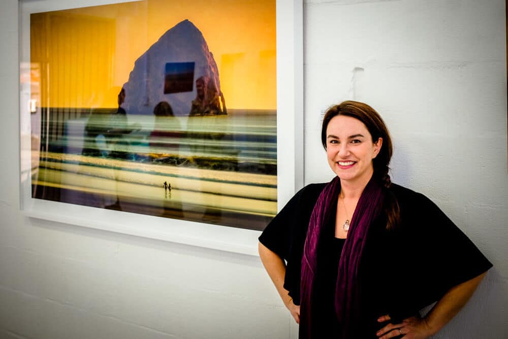
The show ran for the month of May so, due to my slackness in promoting the work of friends you can no longer trek into Leichhardt and see it for yourself ... it being quite suddenly June...
Links
- Gretchen's home page
- Gretchen's Gallery on Smugmug
- Art Est. Gallery and Art School
Assorted Landscapes
As part of my ongoing efforts to add content to my newly humming website (you have to imagine a happy humming here instead of the slow dirgey throaty song playing previously!) I have added a new gallery of images entitled, rather imaginatively, 'Land'. I would add that although there is indeed a landscape in each and every photograph in this collection I will confess up front to there often being a great deal of sky in them too. Anyways, please enjoy :-)
Website Blues
Oh I've been suffering the website blues ... for some months now (actually pretty much since I launched the new website!) the site has been been performing very poorly. By poorly I mean it took an inordinate amount of time to load and in some cases refused to display anything once it had loaded. I found this having a let's say 'detrimental' effect on my posting rate as I was constantly trying to improve the delivery of content rather than actually creating any! Thank you to all the people who took the time to let me know that they could not access the site and the blog! I mean what's the point of having a photography based website/business if no one can see your work!
I had tried optimising all my images, streamlining the code, caching plugins and even dabbled in some CDN (Content Delivery Network) action but nothing seemed to make it go faster. To cut a long story short I got in touch with the techs at my hosting provider (VentraIP) and asked if they could investigate this for me. They found some incorrect setting in my PHP version which, once corrected, made the delivery hum right along. A few more tweaks including updating the way my site caches content and delivers it has really increased my delivery speeds to a fraction of what they were before. Now that the site appears fully functional I have been inspired to update some of the image galleries and overall appearance parameters to make the site a more streamlined experience. Do please give it a go if you find yourself so inspired and let me know if it's not behaving itself! I will have strong words with it ;-P
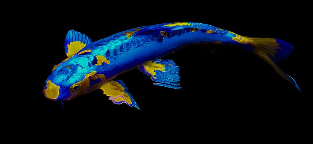
Website blues? Not as blue as this Koi I captured at Taronga Park Zoo in Sydney turned out ... but still it's a pretty picture ... so pretty I had it printed up large and it now hangs on my wall. I'm thinking of doing a series of them and getting RedBubble to make some cushions and tote baggy things for sale.
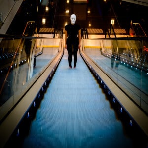
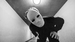
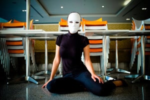
Masked
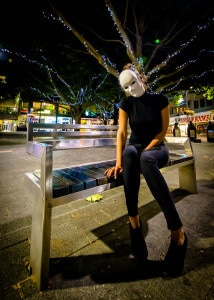
So we made this little movie ... an arthouse piece in a world that plainly isn't. In the movie, we're wearing masks ... well, in the latter stages we're wearing masks plural seeing as we had only one mask when we began filming and had to share it. It wasn't until I came across a supply of masks in Chapel Street in Melbourne over the final weekend that we were able to appear together both wearing masks. But that's an aside.
It's a strange feeling to be wearing masks in public, on the street, in coffee shops and shopping malls. Noone seemed to think it particularly odd, we didn't get asked to leave anywhere and anywhere people did look a little alarmed we just assured them we were "making a movie" and everything was fine! One thing I did notice though was that when I was masked, people I was flashing a reassuring smile to as they walked past or lingered couldn't actually see said reassuring smile; just some nodding weirdo in a mask.
I did take the opportunity to take some stills as we were shooting but likely nowhere near as many as I perhaps should have :-)
Here's a few.
You can watch the movie here
Hot Baby (Take 2) = much happier baby
Back in December I did a baby photo session of then four-week old Bjørn. That sunny Sunday reached 39°C in the afternoon … and little Bjørn was a hot baby and hot babies tend to be a little cranky. I got loads of lovely pictures of Bjørn but they were largely split into two groups … peacefully asleep or grumpy ![]()
Now, I do know that parents love pictures of their children looking happy and smiley so I undertook to do a second session to capture some of the said happy and smiley pictures. Fast forward through the 4-week blur that is Christmas, travel, new year et al and little Bjørn is not so little now ... well ok he's still pretty little ... just not quite so little ... anyways on with the pictures! :-)
We met up at the Botanic Gardens on a Sunday morning and I foolishly wore a white shirt and as I lay on the damp dewy grass in amongst the wallaby poo ... this became apparent ... this foolishness. My shirt looked as though it bore external witness to a coffee drinking problem ... which is quite untrue ... like really.
This Too Shall Pass
UPDATE: Our film has been shortlisted! It will be screened this Friday Night at the Senate Rose Gardens as part of the Enlighten Festival! Woo-hoo!
Last year, about this time, my artistic collaborator Marina and I attended the screening of the 12 finalists in the Lights, Canberra, Action! short film festival. We thought that next year we'll make a film and enter*. Well 'next year' is now 'this year' and the film festival is on again.
Essentially filmmakers have the better part of a week to write, direct and produce a film of no more than 7 minutes duration. All shooting and production must occur within that time. There's a theme (this year's was 'Swings & Roundabouts'). Another twist is the inclusion in the film of items or places provided, scavenger hunt style ... I've included this list below.
So, true to our intentions ... we made a little film together under our arty-collaborative umbrella 2 Tens & A Tomato. The film is titled "This Too Shall Pass" and runs for 6m44s. It's presented in black and white and is a boy meets girl story about passing through a dreamy world of isolation and longing to find intimacy and hope in a roundabout way. Music was produced and performed by the wonderful Charles Sage (Hessien and The Rothko Chapel) solo project y0t0. His moody atmospherics work so beautifully with the film.
Anyways ... here it is. Would love to hear what you think about it. We're kinda a little proud of it and reckon it turned out alright considering we had next to no idea what we were doing.
*We also thought "how hard can it be?" ... the answer as it turns out is "quite hard really" ;-)
List of Items (see if you can spot them all in our film)
- A swing in a park
- A road roundabout
- A set of scales (for weighing)
- 'On the Road Again' sculpture by Ann Ross at Lyons Shops
- A ferris wheel
- The Mandalay Bus (in Braddon)
- The gold tiles outside the ACT Legislative Assembly
- An underpass
- The Chess Pit (Garema Place)
- The High Court (exterior)
An eclectic set of items and sites as you can see.
Lights, Camera, Action! is part of the Canberra 2015 Enlighten Festival and sponsored by artsACT.
Links
- Lights, Canberra, Action!
- Enlighten
- y0t0 (or Year of the Ox)
